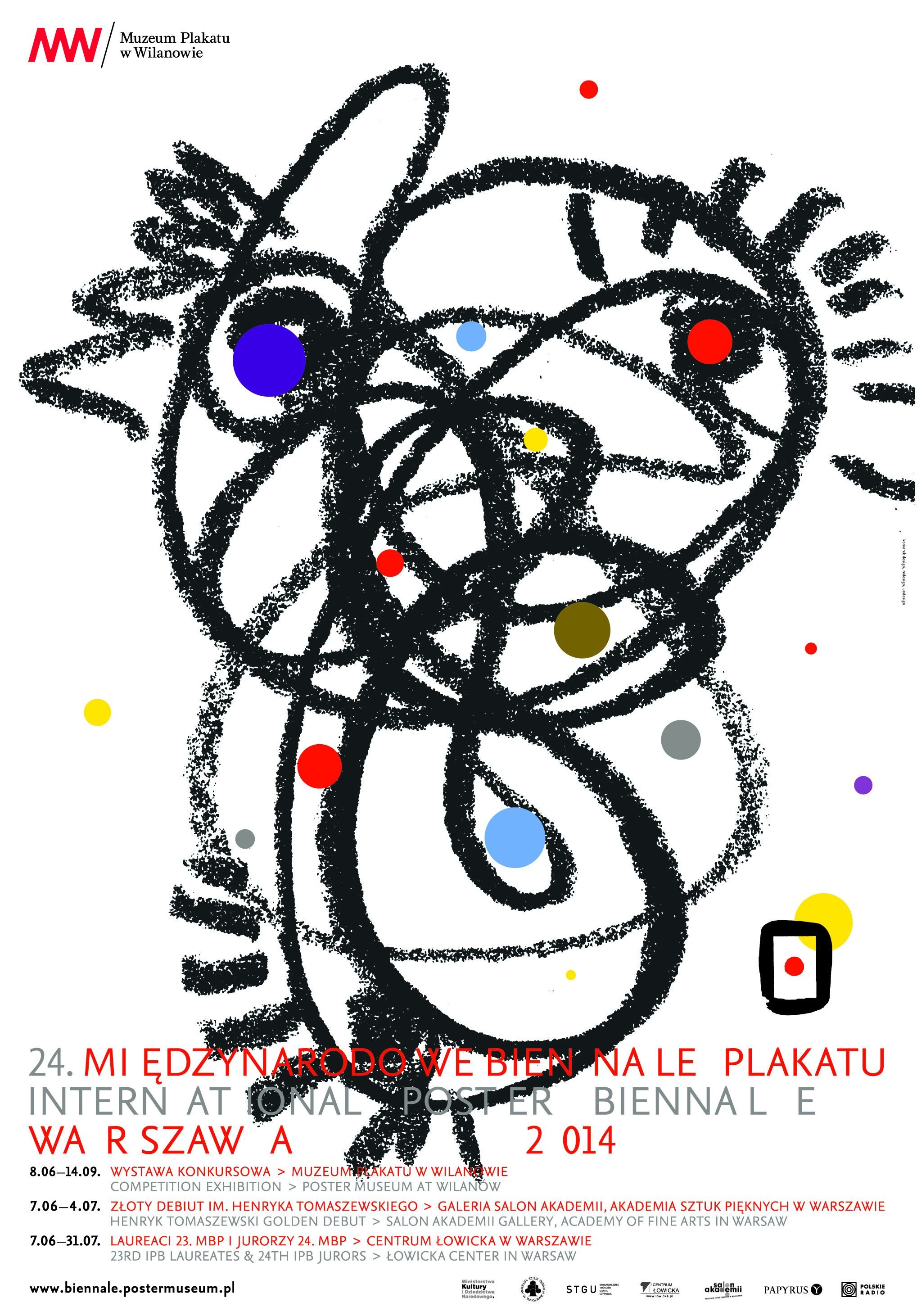
This short text appears in the catalogue of the International Poster Biennale which opened in Warsaw in June 2014. I was one of the jurors.
 The jury of the 24th International Poster Biennale used a website gallery to make their first assessment of the 3814 entries in this year’s competition. Each poster was viewed on-screen as a large thumbnail. A few seconds thought, then a click. Five, four, three, two or one? If an image warranted a closer look or was particularly detailed, another click opened up a larger image for scrutiny.
3814 posters ÷ 2 days viewing = 15.1 seconds per poster
This is a practical way of reviewing a daunting number of poster designs. With an international jury with members from five countries, and with entries from many more, how could it be otherwise? Of course, the poster is a material object, designed to be encountered on a wall or a billboard. But it is also designed to catch the eye in seconds or even less. Fast viewing is the necessary condition of the poster. And, perhaps, it is even under pressure today to deliver its effects with even greater speed. Posters on the street now are accompanied by the animated billboards and, of course, the portable screens in our hands.
So what kind of posters should benefit from this on-line reviewing system? Well, one might imagine that the answer would point to posters which deliver their effects with clear and powerful symbols. This has long been a valued quality of the poster. After visiting Cuba in 1969 and seeing works by poster designers like Felix Beltran and Alfredo Rostgaard, Susan Sontag put it thus: ‘The values of a poster are first those of “appeal,” and only second of information. The rules for giving information are subordinated to the rules which endow a message, any message, with impact: brevity, asymmetrical emphasis, condensation.’ Designer Abram Games put it even more economically when he called for ‘Maximum Meaning, Minimum Means’. So by his measure, simple and boldly graphic devices combined with punchy copy should capture the viewer’s attention.
But when viewing so many posters in a short period of time, one becomes sensitive to repetition. An ‘efficient’ lexicon of symbols rapidly becomes a cluster of stereotypes and even clichés. Every death is a skull; every environmental warning invokes the Earth in the dark vacuum of space; every threatened species is a penguin. It soon becomes clear that other visual qualities have greater appeal: rippling surface decoration, bespoke lettering, and forms of photomontage which unsettle space or time, stand out. In fact, unfamiliarity and complexity are attractive in the company of so much condensation.
This might, of course, be a byproduct of the Biennale’s reviewing process: difference is bound to stand out. But perhaps this is also a sign of the appeal of images which slow us down. In a world of accelerated communication, perhaps one appeal of the poster today be the quiet invitation to look? Might it be possible for posters to slow down perception, and even to create silences in a noisy world?
