This piece appeared in the September 2012 issue of Creative Review. It discusses Unit Editions’ new book on Lubalin – spreads below and details here.
♦


Herb Lubalin did not like talking. A young designer working in his studio would receive a grunt of approval when a design met his standards. Nothing more. And one colleague recalled a trip across the States from coast to coast during which Lubalin only uttered six words. Even his son admitted ‘I loved my father, but we only exchanged maybe a few hundred words in his lifetime.’
Yet words were Lubalin’s business. A brilliant typographer designing magazines and ads from the 1950s to his death in 1981, he drew more expression from the arrangement of letters on a page than anyone before him. And, one can almost hear a New York accent in his layouts. His ads had the bone-dry wit of Madison Avenue in its heyday. And, like the American-Jewish comedians associated with the city like Jackie Mason and Woody Allen, he often sweetened sarcasm with sentiment.
Despite his taciturnity, Lubalin was – as Adrian Shaughnessy’s fine new book shows – a particularly literate designer. In the close-knit environment of the agencies in which he worked before setting up Herb Lubalin Inc. in 1964, he often contributed his skills as a copywriter as well as a designer. ‘I think more about creating an idea, writing the headline,’ Lubalin once admitted ‘than designing the ad.’ In 1968 his studio had the contract to promote Ebony, a magazine aimed at black Americans. Despite its success in attracting readers, Ebony struggled to find advertisers. Combining Irv Bahrt’s stark black and white photographs with acerbic copy, Lubalin’s ads told corporate America that prejudice was making it blind to the dollars in the pocket of the black consumer. Like all great copywriting, the Ebony ads capture the rhythms of speech. ‘Whassamassa, don’t you trust us?’ is not just read, it is heard.
Lubalin’s faith in articulate design was declared in a 1959 trade ad – ‘Let’s Talk Type, Let Type Talk’ – promoting the services of one of his then employer, the advertising agency, Sudler & Hennessey. His reputation as typographer rests on a small clutch of typefaces; Avant Garde Gothic, Lubalin Graph and Serif Gothic. Shaughnessy is particularly good on the teamwork involved in creating these fonts, giving fair-minded credit to his collaborators, Tom Carnase and Tony Di Spigna. But perhaps Lubalin’s real achievements lay in the creative and unorthodox ways that he composed lettering. Exploiting the potential offered by photocomposition, he would reverse, slant and distort letters. And by dramatically reducing letter spacing or by combining different thicknesses, Lubalin expanded the expressive potential of any type face. Even though he made full use of new technology, his designs seemed resonate with American history. Occasionally, he was accused of kitsch. Commissioned to design a poster to encourage voter registration in the 1964 presidential election, Lubalin designed a self-consciously nostalgic ad to conjure up the history of American democracy. The client spiked the design, describing it as ‘too old fashioned’.
Despite being in high demand in the booming world of advertising in the 1960s, Lubalin increasingly sought work which offered greater freedom of invention. Agencies were filling up with psychologists and pollsters who – in Lubalin’s view – underestimated the intelligence of their audience and suppressed the intuitive creativity of designers. He was much more interested in appealing to switched-on minds than stirring up unconscious consumer desires. His long and close relationship with publisher Ralph Ginzburg provided these kinds of opportunities. The young writer approached Lubalin in 1961 to design a new up-market periodical called Eros, a magazine which took love and sex as its theme. Eros became the subject of one of the most notorious freedom-of-speech trials in post-war America with Ginzburg eventually being imprisoned in 1972 for distributing obscene material. Looking at the magazine today, this hardly seems credible. The first issue – published on Valentine’s Day in 1962 – featured seventeenth century erotic poems by the Earl of Rochester as well a gritty photo-spread by Gerry Winograd recording brief encounters on the New York subway. Lubalin’s elegant spreads, playing with scale and different paper stocks, emphasized the upmarket ambitions of the publisher. The fourth and final issue of the large-format hardback featured a series of photos that the magazine described as ‘poem on interracial love’. Ralph Hattersley’s portraits of a very modest set of clinches is widely credited as being the trigger for the court case.
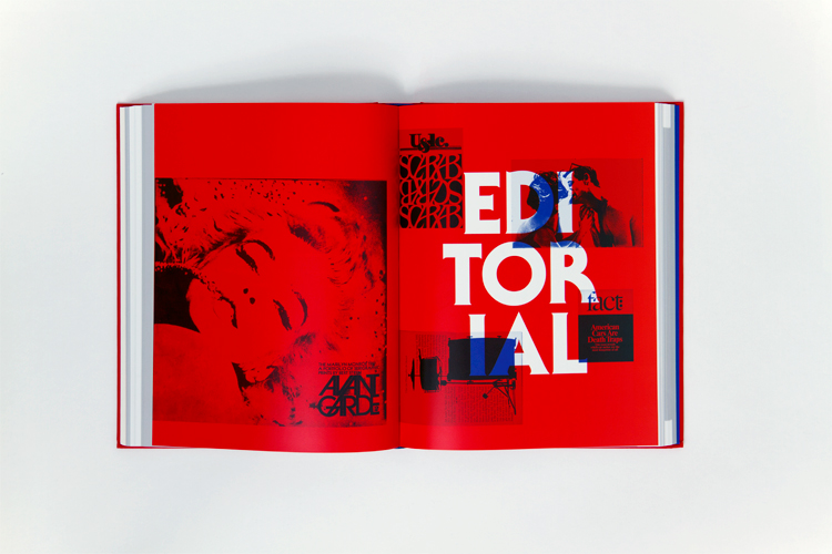
Ginzburg and Lubalin were not deterred and, whilst the case went through a series of appeals, they put Eros on hold and launched two other titles; fact:, a hard-hitting title which often featured exposés and investigative reports into the failings of consumerism, and the burgeoning war in Vietnam, and Avant Garde, a magazine which sought to combine the arts with politics. Published before America was convulsed by the stand-off between the state and the Counter Culture, Eros and fact: (1964-67) played a part in the opening up of the American imagination. The masthead of the first issue of fact: announced ‘This magazine is dedicated to the proposition that a great magazine, in its quest for truth, will defy not only Convention, not only Big Business, not only the Church and the State, but also – if necessary – its readers.’
By contrast Avant Garde, published between 1968 and 1971 – the high point of the Counter Culture – was off the mark. Radical politics was hardly well served by kiss and tell stories by Norman Mailer or trippy photographs of Marilyn Monroe, however well printed and wittily designed. Whilst Lubalin was not an ideologue, his work with Ginzburg illustrates his professional and personal ethos. He was a liberal in the full sense of the word, committed to freedom of speech and thought as well as the freedom of the market place. (He described himself as a ‘schmuck’ for not securing a better deal for his work on the best-selling brochure for The Sound of Music, a world-wide hit). When challenging censorship and conservatism, the liberal agenda had clear targets. When its battles had been won, new-found freedoms could look like exploitation. The summer 1971 issue of Avant Garde featured Anthon Beeke’s alphabet, AIR, formed from the bodies of young women, shot from above in an Amsterdam gym. There is little liberation in stretching a body to form the bar in the letter ‘A’ or pushing the arms apart to form the tie in an ‘E’.
Lubalin died prematurely at the age of 63 in 1981. Much feted in his own lifetime and, again, recently, Shaughnessy argues that he was neglected for so long because he did not write books or lend his name to manifestos. With mainstream clients, he was easily dismissed as a pillar of convention. The fact that Lubalin died on the eve of the digital revolution in graphic design also seemed to accelerate his relegation. It seems extraordinary that in 1979 one commentator could call him ‘King of Illegibility’, largely for his tendency to overlap letterforms. That crown was to be quickly seized by others in the 1980s.
